Overview
🔹 Problem: The African American Diabetes Association (AADA) website was inaccessible, overwhelming, and lacked engagement.
🔹 Goal: Improve accessibility, user engagement, and drive donations.
🔹 Role: Sole UX Designer & Content Writer
Key Problems
Project Goals
Design Process:
Low-Fidelity
Mid-Fidelity
High-fidelity
Design Decisions:
Overwhelming, hard-to-read content
Confusing navigation
Key info unclear & difficult to find
✅ Primary (P0): Educate users on African American health disparities in an engaging way.
✅ Secondary (P1): Increase donations.
✅ Long-term: Grow community involvement, volunteers & chapters.
Audit Findings:
Content was dense & inaccessible
Navigation was cluttered & confusing
Poor accessibility (color contrast, layout issues)
Recommendations:
✅ Simplify & structure content for better readability
✅ Improve accessibility (contrast, color-blind-friendly design)
✅ Use culturally relevant visuals for engagement
✅ Add interactive elements to drive donations
🔹 Structured Information Architecture for intuitive navigation
🔹 Prioritized symptoms, treatments & risk factors for key health topics
🔹 Simplified complex medical terms into user-friendly language
🔹 Ensured educational equity for better comprehension
Prominent “Donate Today” button on every page
Curated visuals showcasing diverse African Americans for relatability
Balanced gender representation to address healthcare disparities
✅ 90% of stakeholder feedback incorporated
✅ Reading level reduced from 12th grade → 7th grade for accessibility
✅ 80% of users satisfied with improved readability
✅ Stakeholders rated the design 4.5/5 for usability & vision alignment
Full project ownership from research to prototype
Overcame communication delays with updates & adaptability
Demonstrated how inclusive design drives engagement & action


Affinity mind map to organize information architecture
Site map using low-fi wireframes in Figma
Images labeled 1 and 2
Before and after simplifying content
Outcomes & Impact
Reflection

Individuals living with type 1 or type 2 diabetes are at increased risk for depression, anxiety, and eating disorder diagnoses. Mental health comorbidities of diabetes compromise adherence to treatment and thus increase the risk for serious short- and long-term complications, which can result in blindness, amputations, stroke, cognitive decline, decreased quality of life, and premature death.
It becomes more difficult to effectively control diabetes when confronted with mental health issues, given the substantial influence of emotions, thoughts, and stress on overall well-being. Diabetes patients frequently suffer from conditions like anxiety and depression, which can exacerbate adherence to medical regimens and escalate the risk of complications related to diabetes.


Research & Insights
Interactive designs
🔹 Refined wireframes with brand colors & interactive elements
🔹 Created a responsive design for different devices
Testing & Feedback
Stakeholders & diabetic users tested the redesign
Key insights:
Users loved the readability improvements (larger fonts, better contrast)
Stakeholders valued aligned vision & goals

Design file with layout options for usability testing
The Redesign
The Redesign
Current Website
Handoff & Implementation
🔹 UI Kit / Style Guide for developers to ensure consistency
🔹 Live Wix site launched

Style Guide

"Sagon yn lantīr bona ao ūndegon jorrāelza."


The African American Diabetes Association (AADA), a non-profit diabetes education organization, needed a comprehensive website redesign to improve accessibility, user engagement, and information presentation. The original website contained inaccessible content and un-engaging design elements. The goal was to create an intuitive platform that educated users on African American health disparities and encouraged donations to support the cause.
The African American Diabetes Association (AADA), a non-profit diabetes education organization, needed a comprehensive website redesign to improve accessibility, user engagement, and information presentation. The original website contained inaccessible content and un-engaging design elements. The goal was to create an intuitive platform that educated users on African American health disparities and encouraged donations to support the cause.
After an initial meeting with the CEO of AADA, we established the following priorities:
Primary Goal (P0): Inform users about African American health disparities in an accessible and engaging way.
Secondary Goal (P1): Increase donations to support AADA’s mission.
Long-term goal: Growth
Get more people involved
Increase volunteer participation
Expand Charters / Chapters
The redesign aimed to create an inclusive and engaging experience that better informed users and increased support for AADA's mission.
I conducted a thorough website audit and presented a slideshow of recommendations to stakeholders. Key issues identified included:
Overwhelming information that needed to be condensed and reorganized.
Cluttered and inconsistent navigation making it confusing to find important information
Accessibility concerns due to ineffective color choices and page layout.
Key Recommendations:
Condense and present information in a digestible, engaging, and accessible format.
Improve accessibility better contrast ratios and color-blind-friendly designs.
Incorporate interactive features to keep users engaged and motivated to donate.
Use culturally relevant visuals that reflect the African American community
Outcomes and Impact:
90% of stakeholder feedback was incorporated into the final design, ensuring alignment with their vision.
Reduced the reading level from 12th grade to 7th grade by simplifying content to ensure accessibility for a broader audience.
80% of users expressed satisfaction with the larger text and improved readability during usability testing.
Stakeholders rated the redesigned prototypes 4.5/5 in aligning with their vision for an accessible, user-friendly site.
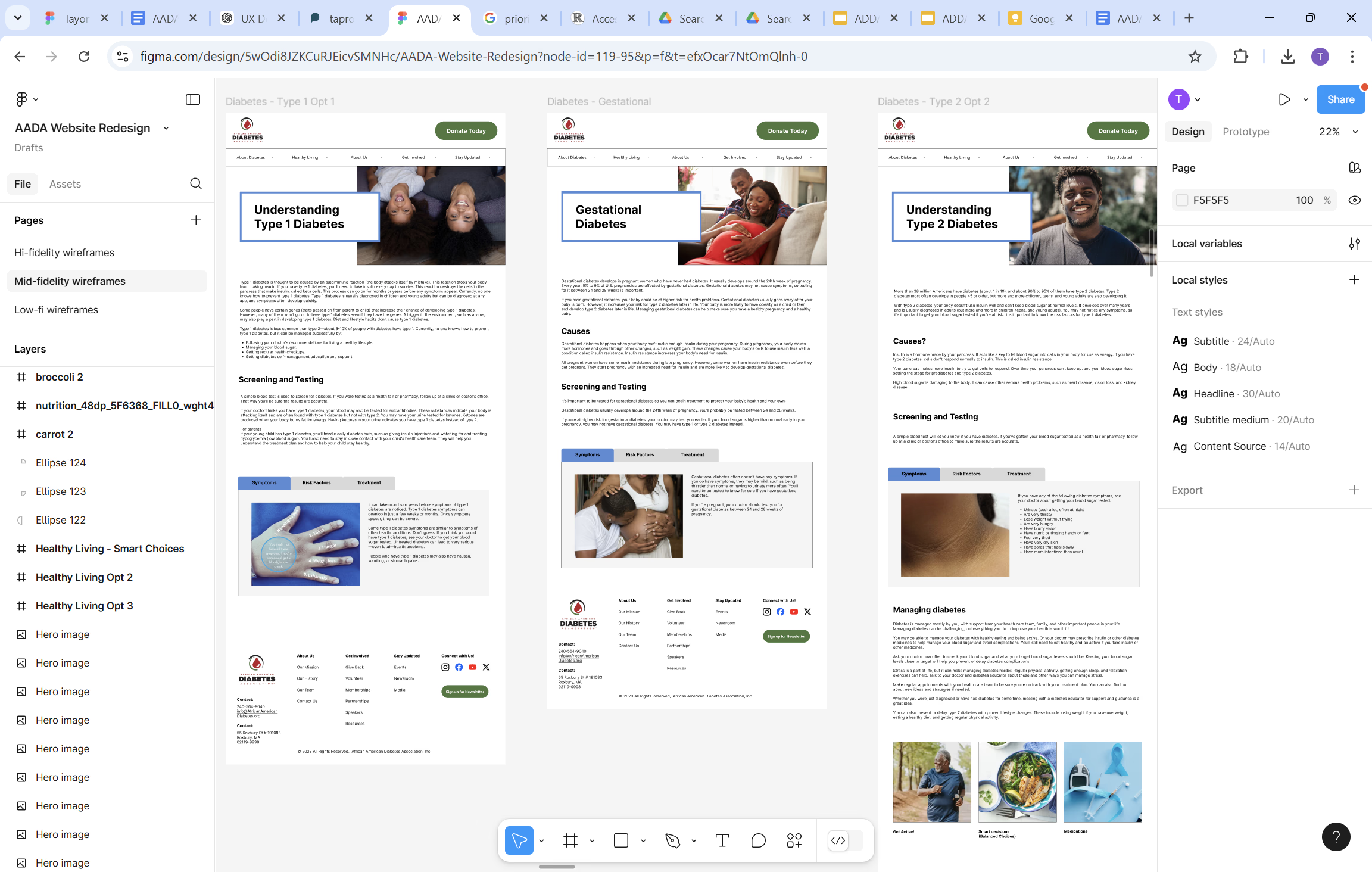
Information Architecture:
Organized content to ensure cohesive user navigation.
Outlined pages to prioritize the most relevant and engaging information.
Identified and highlighted disease symptoms, treatments, and risk factors as the most important or relevant information when a user is trying to understand or learn about a condition.
Through content writing, I made the information more inclusive, keeping education equity in mind by replacing a lot of the technical / scientific words from the original website with layman’s or user friendly terms.
This was to make the information easier to understand for users.
Through content writing, I made the information more inclusive, keeping education equity in mind by replacing a lot of the technical / scientific words from the original website with layman’s or user friendly terms.
This was to make the information easier to understand for users.
Refined wireframes and added more brand colors / elements
Developed interactive components to engage users while informing them with easy to understand, digestible information.
Refining hi-fidelity prototype for testing
Refined wireframes and added more brand colors / elements
Developed interactive components to engage users while informing them with easy to understand, digestible information.
Refining hi-fidelity prototype for testing
Overview
Overview
AADA Website Overhaul: Redesigning for Clarity, Engagement & Impact
Problems
Problems
Role
Role
Stakeholders
Stakeholders
Goals
Goals
Research & Exploration
Research & Exploration
Reflection
Reflection
Impact
Impact
Low-fidelity Designs
Low-fidelity Designs
Mid-fidelity Designs
Mid-fidelity Designs
Design Process:
Design Process:
Testing / Feedback
Testing / Feedback
The Redesign
The Redesign
Hi-fidelity Prototype
Hi-fidelity Prototype
Design Decisions
Design Decisions
UXW
UXW


1
2


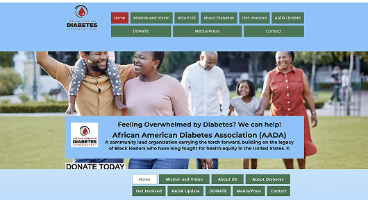
I designed a page header with a prominent “Donate Today” button on every page to reinforce the call to action.
Visual Enhancements:
Emphasized curating the content and visuals to resonate with African American users (e.g., showing how health conditions manifest in this population).
Focused on relatable and impactful visuals, including African Americans of all ages and genders, to foster emotional connection.
I chose to display balanced gender representation to counteract disparities in healthcare engagement, especially among men.
Prototype file showing header “Donate Today” button leads to Donate page
Culturally relevant images curated for each page
Interactive designs
Design file of multiple layout option for newsroom page for usability testers to choose one
Current Website
Current Website
Before
Website Redesign
After
This project highlighted my ability to manage full project ownership, from research to prototyping, while balancing user needs and stakeholder goals.
I overcame challenges like delays in communication by providing consistent updates and pivoting designs as needed.
The redesign demonstrates how thoughtful, inclusive design can drive engagement, inform users, and inspire action.
Documentation & Handoff
Documentation & Handoff
I included a UI Kit / Style guide in the design file for the software engineer to ensure consistency across pages while allowing easy replication and rapid design for future updates.
I included a UI Kit / Style guide in the design file for the software engineer to ensure consistency across pages while allowing easy replication and rapid design for future updates.
The AADA website presented several challenges:
Overwhelming and inaccessible content
Confusing navigation
Key information was unclear
The AADA website presented several challenges:
Overwhelming and inaccessible content
Confusing navigation
Key information was unclear
Sole UX Designer
Content Writer
Sole UX Designer
Content Writer
CEO: Mr. Rock
Board members
AADA user
CEO: Mr. Rock
Board members
AADA user
UI Kit / Style guide
UI Kit / Style guide
Stakeholders and users participated in testing the redesign in which I:
Clarified information architecture for features / content that the organization wanted to implement in the future
Incorporated feedback from stakeholders and diabetic users leading to refining errors in text and a more responsive design for devices
Presented multiple layout options to stakeholders for feedback on which they found easier to understand and most visually appealing, allowing them to influence final decisions.
Key takeaways included:
Diabetic users appreciated accessibility improvements, such as larger fonts and better contrast
Diabetic users and families appreciated the educational equity - making the information easy to understand
Stakeholders valued how the redesign aligned with their vision and goals.


Affinity mind map to organize information architecture
Site map using low-fi wireframes in Figma
Individuals living with type 1 or type 2 diabetes are at increased risk for depression, anxiety, and eating disorder diagnoses. Mental health comorbidities of diabetes compromise adherence to treatment and thus increase the risk for serious short- and long-term complications, which can result in blindness, amputations, stroke, cognitive decline, decreased quality of life, and premature death.
It becomes more difficult to effectively control diabetes when confronted with mental health issues, given the substantial influence of emotions, thoughts, and stress on overall well-being. Diabetes patients frequently suffer from conditions like anxiety and depression, which can exacerbate adherence to medical regimens and escalate the risk of complications related to diabetes.
After
Before
2
Prototype file showing header “Donate Today” button leads to Donate page
Culturally relevant images curated for each page
Website Redesign
1
Hi-fidelity Designs
Hi-fidelity Designs
"Sagon yn lantīr bona ao ūndegon jorrāelza."

AADA Website Overhaul: Redesigning for Clarity, Engagement & Impact
"Sagon yn lantīr bona ao ūndegon jorrāelza."